Images
Images are often the most persuasive element on a page—they can establish credibility, evoke a sense of place, or make an argument that words alone can’t. Xanthan gives you several ways to use them, from simple inline figures to full-width panoramic headers and before/after comparison sliders.
Inline images
Use the figure.html include to place images in your content. Copy and paste this code anywhere you want an image to appear:
{% include images/figure.html
  class="right"
  width="40%"
  caption="What a nice view"
  alt-text="Color photograph showing hiking trails in a Sandia foothills canyon."
  image-path="/assets/images/backgrounds/hike-1.jpg"
%}
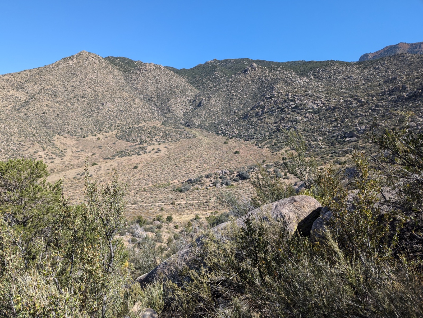
What a nice view
The image appears to the right, with text flowing around it.
Parameters
| Parameter | Options | What it does |
|---|---|---|
class |
left, center, right |
Where the image sits on the page |
width |
Any CSS value (e.g. 40%, 300px) |
Width of the image (default: 40%) |
caption |
Text | Caption displayed below the image |
alt-text |
Text | Accessibility description for screen readers |
image-path |
File path | Path to the image file |
Image paths: the most common source of problems
Paths can be relative or absolute, and mixing them up is the number one reason images don’t appear.
- Absolute path (starts with
/):/assets/images/photo.jpg— works from any page on your site, because it starts from the site root. This is the safer choice. - Relative path (no leading
/):images/photo.jpg— relative to the current page’s location. A path that works onessays/my-essay.mdwon’t work onindex.mdif the image isn’t in the right place relative to that page.
When in doubt, use absolute paths. They always resolve the same way regardless of which page you’re on. And remember: paths are case-sensitive. Photo.jpg is not the same as photo.jpg.
Alignment examples
Right-aligned (most common for essay-style pages):
{% include images/figure.html
  class="right"
  width="60%"
  caption="What a nice view"
  image-path="/assets/images/backgrounds/hike-1.jpg"
%}
What a nice view
Etiam finibus risus et sagittis suscipit. Praesent id nisi metus. Vivamus odio ligula, iaculis vestibulum convallis id, vehicula at justo. Sed vestibulum elit at ante pellentesque pretium. Vestibulum euismod tempus sem sit amet scelerisque. Curabitur hendrerit fermentum rutrum.
In hac habitasse platea dictumst. Sed ultrices venenatis nunc et eleifend. Praesent sapien enim, porta egestas tortor vitae, imperdiet mollis velit. Cras quis quam lacus.
What a nice view, again
Left-aligned at 25% width—small but effective for portraits or icons. Text wraps around the right side.
Vestibulum euismod tempus sem sit amet scelerisque. Curabitur hendrerit fermentum rutrum. Nam suscipit dictum purus, non rhoncus dui sodales nec. Etiam convallis arcu metus, ut cursus risus porttitor sit amet. Duis ut sapien varius libero efficitur vehicula.
In hac habitasse platea dictumst. Sed ultrices venenatis nunc et eleifend. Praesent sapien enim, porta egestas tortor vitae, imperdiet mollis velit.
Centered at 50%—good for highlighting a single image between sections:
What a nice view, again
Side by side
Set both images to class="left" with width="48%" (slightly less than 50% to leave room for margins):
Here’s an image on the left.
Here’s an image on the right.
{% include images/figure.html
  class="left"
  width="48%"
  caption="Here's an image on the left."
  image-path="/assets/images/default.jpg"
%}

{% include images/figure.html
  class="left"
  width="48%"
  caption="Here's an image on the right."
  image-path="/assets/images/default.jpg"
%}

<p style="clear:both"></p>
The <p style="clear:both"></p> line ensures text starts below both images rather than creeping into the gap beside them.
Full-width
Set width="100%" for images that span the content area. Make sure the source image is large enough to avoid looking grainy.
Make sure your image is large enough to be 100% width or it will look grainy.
Alt-text
Why Alt-Text Matters
Alt-text (alternative text) is a written description of an image that screen readers read aloud for visually impaired users. Including alt-text makes your site accessible to everyone.
- Describe the image content and context, not just what you see
- Focus on what’s relevant to your narrative or argument
- Keep it concise but descriptive (typically 1-2 sentences)
- Avoid redundant phrases like ‘image of’ or ‘picture of’
If you don’t include an alt-text parameter, the caption will be used as the alt-text, which is better than nothing but not always ideal.
Pro tip: Alt-text and captions serve different purposes. Captions can be more interpretive or contextual (‘This transformation took only six months’), while alt-text should be descriptive (‘Two photos side by side showing a vacant lot and then a completed brick building’).
Header images
A header image is a large banner across the top of the page. You set it in the page’s front matter rather than in the content:
---
title: My Page Title
layout: xanthan
header-image: /assets/images/backgrounds/pano-1.jpg
---
Controlling height and position
Two optional front matter fields fine-tune how the header appears:
---
title: My Page Title
layout: xanthan
header-image: /assets/images/backgrounds/pano-1.jpg
header-height: 50vh
header-position: center
---
| Field | Default | What it does |
|---|---|---|
header-height |
40vh |
Height of the header (e.g. 50vh, 300px) |
header-position |
(browser default) | Which part of the image to show (center, top, 200px, 50% 80%) |
header-position is particularly useful when you have a large image but only a specific part—the sky, the bottom half—is what you want visible in the header crop.
Jumbotron images
Even a “full-width” inline image is constrained by the page margins. A jumbotron breaks out to fill the entire browser window, and you control the height.
{% include images/jumbotron.html
  height="50vh"
  image-path="/assets/images/default.jpg"
  title=""
%}
| Parameter | Default | What it does |
|---|---|---|
height |
40vh |
Height of the jumbotron |
image-path |
(required) | Path to the image |
title |
(none) | Optional heading overlaid on the image |
text |
(none) | Optional subtitle |
background-position |
(browser default) | Which part of the image to show |
Jumbotrons also work well as section dividers between major parts of a long page.
Before/after slider (Juxtapose)
Compare two images with a draggable slider—ideal for historic vs. contemporary photos, before/after transformations, or any visual comparison.
{% include images/juxtapose.html
  image1="/scrollstories/forest/images/mvh-tv-room.jpg"
  image2="/scrollstories/forest/images/mvh-hist-common-room.jpg"
  caption="The TV room becomes the History Department Common Room."
%}
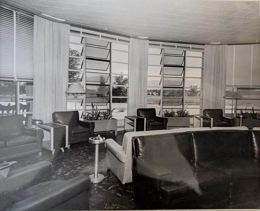
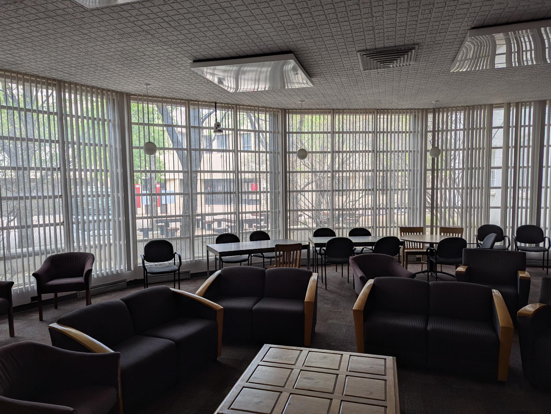
From the TV room to the Chair room (actually, the History Department Common Room). With a less good view of the mountains.
| Parameter | What it does |
|---|---|
image1 |
Path to the first (left) image |
image2 |
Path to the second (right) image |
caption |
Optional caption below the slider |
starting-position |
Where the slider starts (default: 50%) |
The effect is most striking when the two images are taken from the same vantage point.
Image carousel
Display a series of images as a slideshow. This requires a bit more code—you define three lists (images, headers, captions) and then call the carousel include:
{% assign images =
"/scrollstories/forest/images/mvh-construction.jpg,
/scrollstories/forest/images/mvh-room-cost.jpg,
/scrollstories/forest/images/mvh-tv-room.jpg" | split: ','
%}

{% assign headers =
"A Photo Title,,
No caption here" | split: ','
%}

{% assign captions =
"It's useful to have informative captions|
This image has a caption, but no title|
" | split: '|'
%}

{% include images/carousel.html
  width="80%"
  class="center"
  images=images
  headers=headers
  captions=captions
%}
A Photo Title
It's useful to have informative captions
This image has a caption, but no title

No caption here
| Parameter | What it does |
|---|---|
width |
Width of the carousel (default: 100%) |
class |
Alignment: left, center, right |
id |
Unique ID if you have multiple carousels on one page |
images |
List of image paths |
headers |
List of slide titles (use empty values for no title) |
captions |
List of slide captions (split on \| to allow commas in text) |
Peekaboo headers
A peekaboo header creates a parallax-like effect where a background image is revealed as you scroll. Unlike a jumbotron (which scrolls with the page), a peekaboo header stays fixed and the page content slides over it.
{% include scrollybox/bg.html
  height="40vh"
  image-path="/assets/images/backgrounds/pano-1.jpg"
%}
Troubleshooting
Image doesn’t appear:
- Check that the file path and filename match exactly (paths are case-sensitive)
- Verify the image file has been committed to your repository
- Make sure the path starts with
/for absolute paths or is correct relative to the current page
Image looks grainy or stretched:
- Use images large enough for the display width (at least 1200px wide for full-width images)
- JPG works well for photographs; PNG is better for diagrams or screenshots with text
Header image not showing:
- Ensure
header-imageis in the front matter block (between the---lines), not in the page content - Check the path carefully—it should start with
/
For more help, see Troubleshooting.